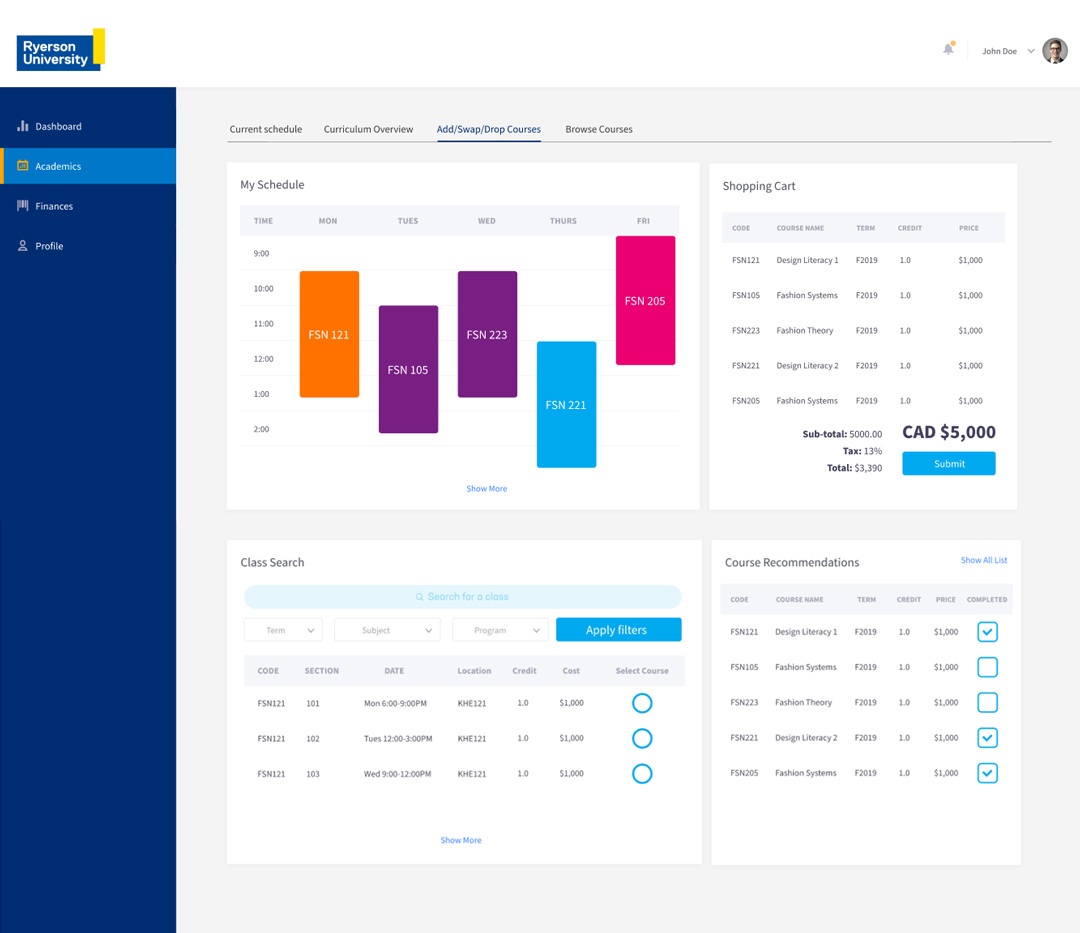
Ryerson University’s RAMSS Redesign
As a final project for the Interaction Design course, my teammates and I redesigned Ryerson University’s Administrative Management Self Service system (RAMSS) using User-Centered Design principles. RAMSS is where students access and manage their academic and financial information. The challenge focused on redesigning the course enrollment process in the portal.
Academic project completed for the Interaction Design course. Master of Digital Media, Toronto Metropolitan University.
ROLE
UX/UI Designer
TEAM MEMBERS
Aahd Alanqar, Aadil Khan and Kelvin Li
TOOLS
Adobe XD, Miro,
YEAR
2020
Overview
After analyzing the current user journey in RAMSS, we identified different issues students face when accessing their academic registration:
-
It is not a personalized experience. Each program has different academic requirements for graduating. RAMSS doesn’t show the requirements the student has to fulfill.
-
To find a course, the user has to know specifically the course term and number and search for it in an external catalog.
-
The interface is outdated, confusing, and hard to use, with no hierarchy in place.
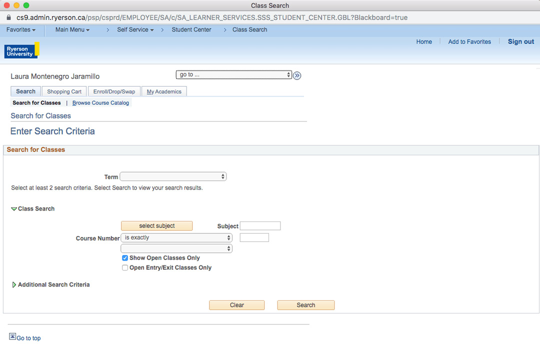
Current view of RAMSS
User Research
To better understand our users, we researched the university’s demographics and talked to fellow students about their experience with the platform while adding a new course. Using this information we build an empathy map.
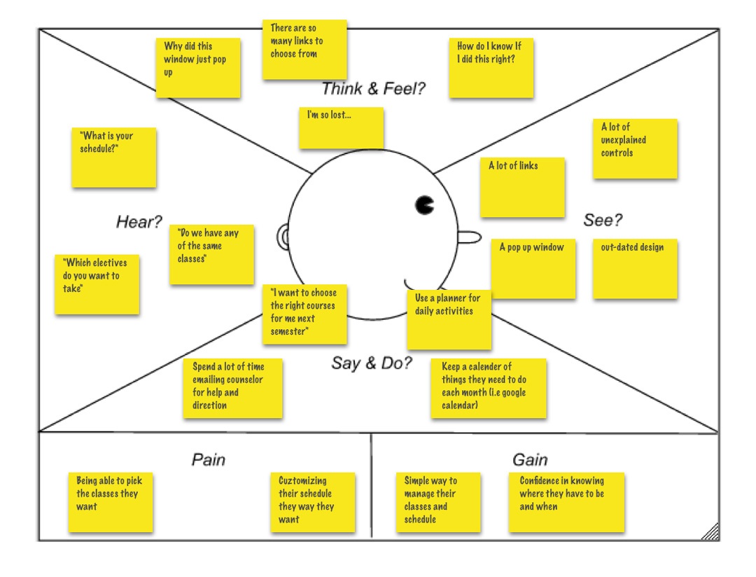
Key findings included:
The students’ main pain points are being able to pick the classes they want and customize their schedule as needed. A student wants to know his general degree progress, what courses he should enroll in the next semester, and the final schedule he will have.
This led to the creation of a user persona and a user journey.
Persona
User Journey
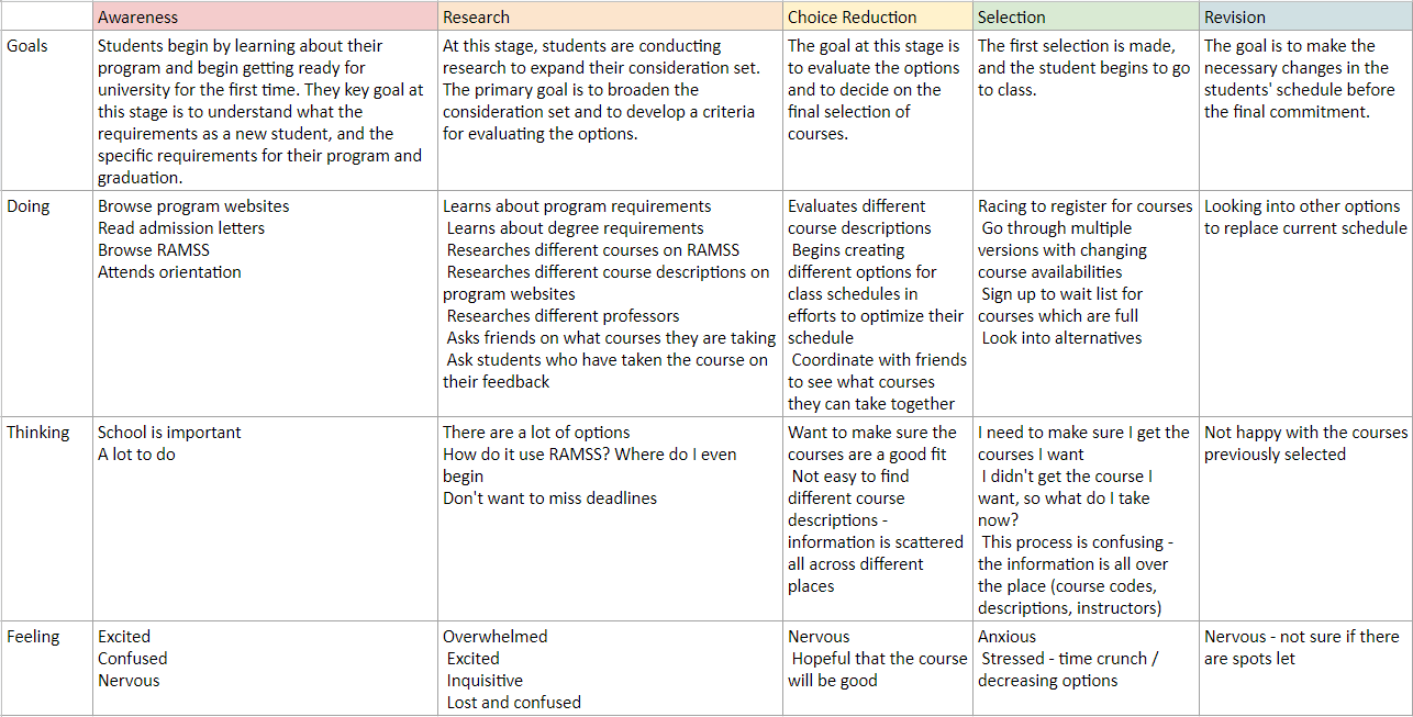
Prototyping
These findings were essential in order to brainstorm solutions and consider new design parameters and functionalities that we later added to a low fidelity prototype we built using Adobe XD. These included:
Improved navigation
-
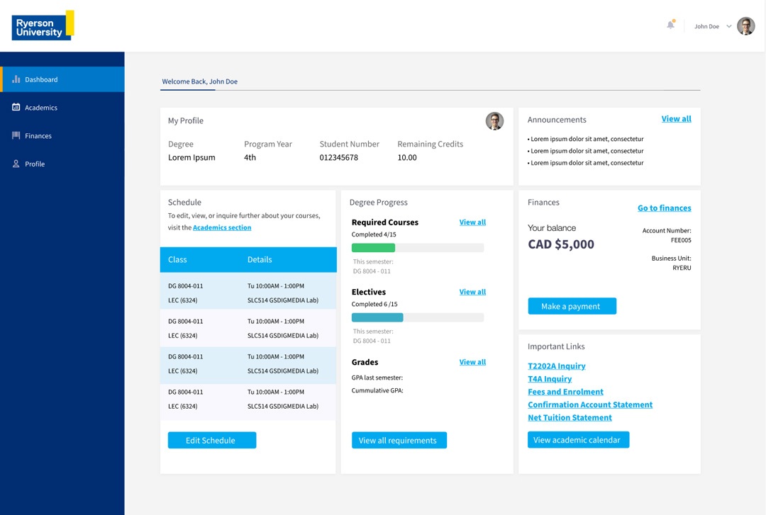
Added an easy-to-use left bar that groups all functionalities in four main sections: dashboard, academics, finances, and profile.
-
Added a horizontal secondary menu on all pages with secondary links.
-
Used both words and icons in the left bar to make it clear to the user what the sections are about.
-
With this navigation, we aimed for a coherent conceptual model.
Features
-
A dashboard with important information and quick links.
-
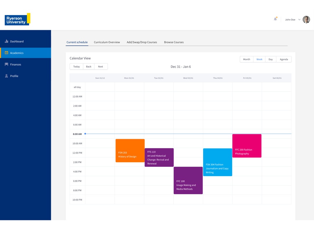
The student’s current schedule.
-
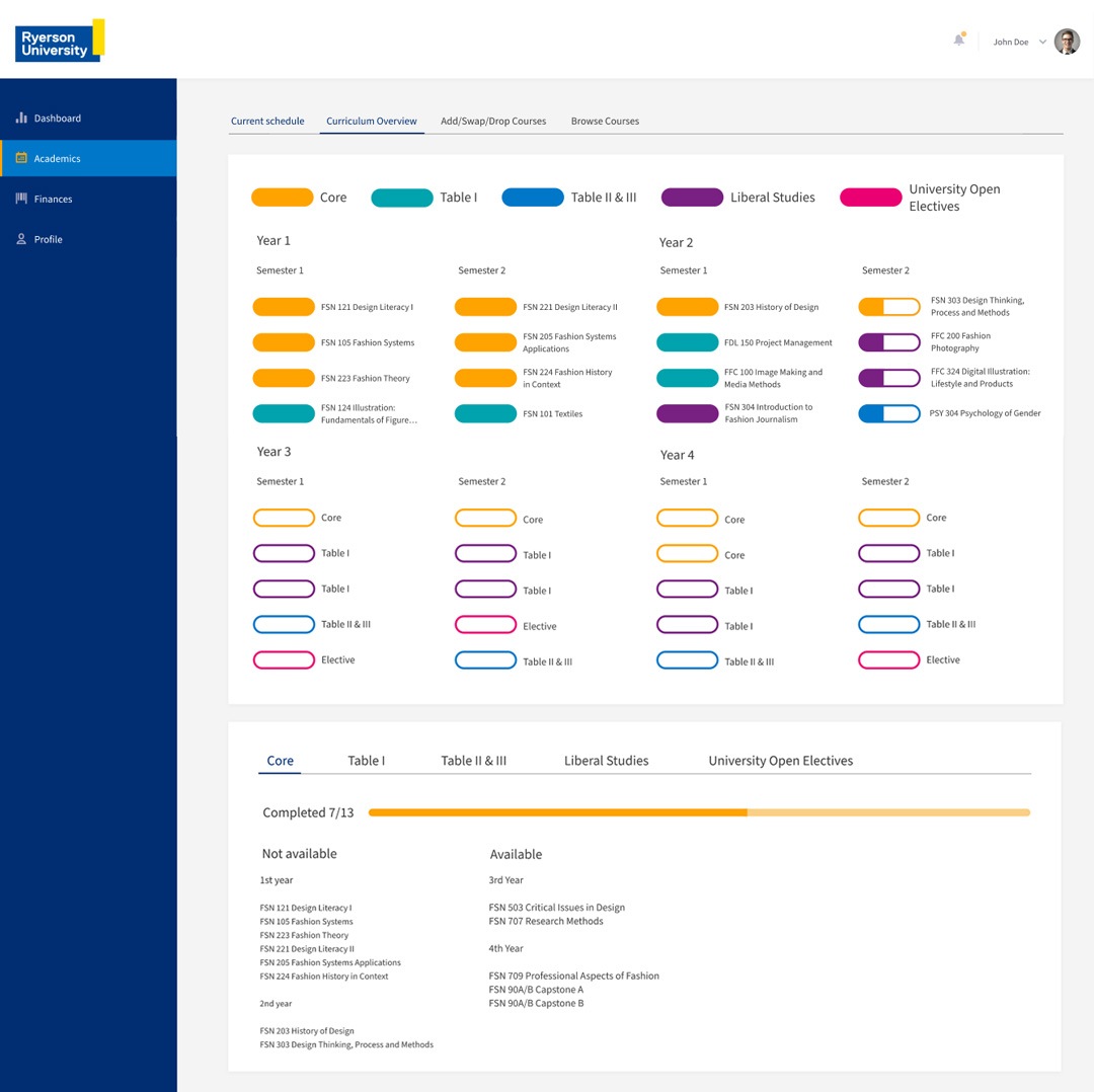
A curriculum overview of the student’s degree process that lets him know his progress and the courses he can take on future semesters.
-
Simple add, swop and drop tool that includes a smart course search, an add course button, and a list of recommended courses.
-
Added feedback tools such as notifications and the user’s picture and name on the top right corner so he knows who is logged in.
Look and Feel
-
Implemented a clean flat design with consistent styles throughout all pages.
-
Used conventions such as icons and colors to reduce the user’s cognitive load.
-
Used Ryerson’s brand guidelines, color palette, and logo to keep the design consistent with the University’s branding.
Login page

Dashboard
Academics – Current schedule
Academics – Curriculum Overview
Academics – Add/Swap/Drop courses tool
