The Family Support Network for Employment
As a web designer at Lulo, I designed and developed the website for the Family Support Network for Employment (FSNE), a non-profit initiative that advocates for inclusive and paid employment for individuals with intellectual disabilities in Ontario. The website includes a series of informative videos targeted to different stakeholders, personal vlogs from self-advocates, and an 8-module free course for families to advocate, find and secure paid employment for their family member with an intellectual disability.
ROLE
UX designer and WordPress developer
PRODUCTION COMPANY
Lulo
CLIENT
The Family Support Network for Employment
TOOLS
Adobe XD, Photoshop, Illustrator, WordPress, LearnDash
YEAR
2020-2021
Project goals:
-
Build a website to communicate the FSNE’s vision and values to the community they serve.
-
Allow the stakeholders to find the information they need, efficiently and fast. This meant designing a useful product for job seekers, families, employers, employment agencies, government, and educators.
-
Build a simple but efficient website, with time and budget constraints.
Research and Ideation:
-
We had numerous meetings with FSNE’s founders to understand the initiative’s approach. We learned their methodology for inclusive employment for individuals with developmental disabilities involves different stakeholders and different practices throughout an individual’s life.
-
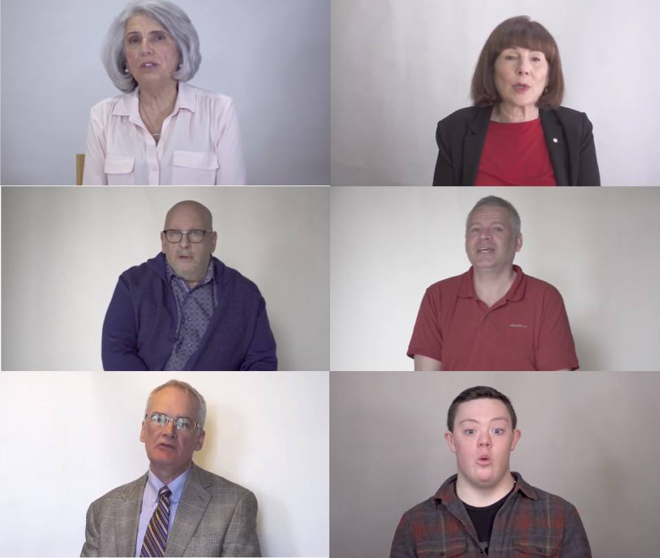
At an event held by the initiative, we interviewed different participants. We selected the best soundbites and grouped them into different videos that reflected best practices and principles for different stakeholders.
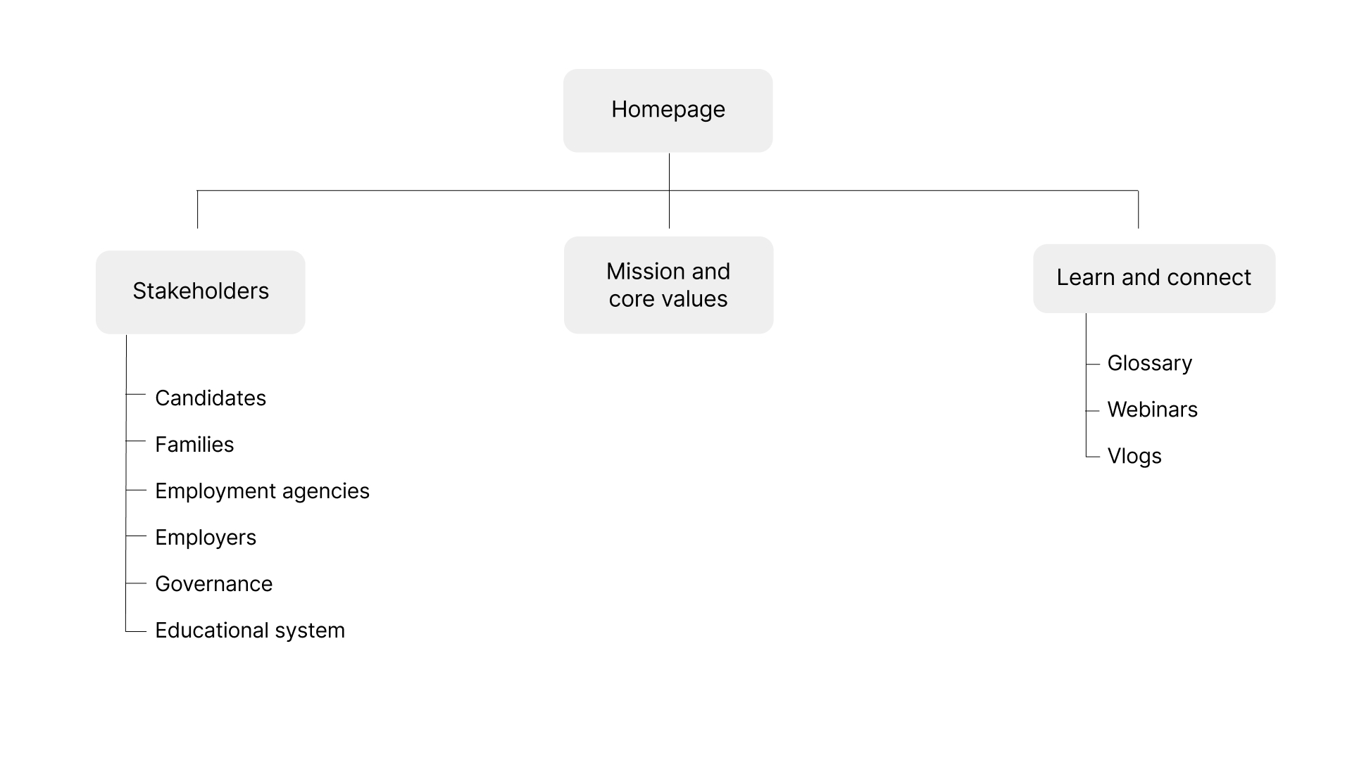
With a clear view of the project’s scope, we designed the site’s information architecture.
For new users, we included a Where-to-Start section on the homepage with videos of the founders explaining FSNE’s mission and core values.
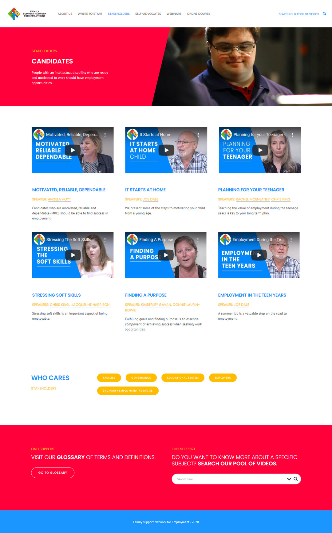
We also included a dedicated page per stakeholder, so users can easily find information that is relevant to them.
The webinars, glossary and vlogs pages would help users learn more and stay up-to-date on the initiative’s latest activities.
Design
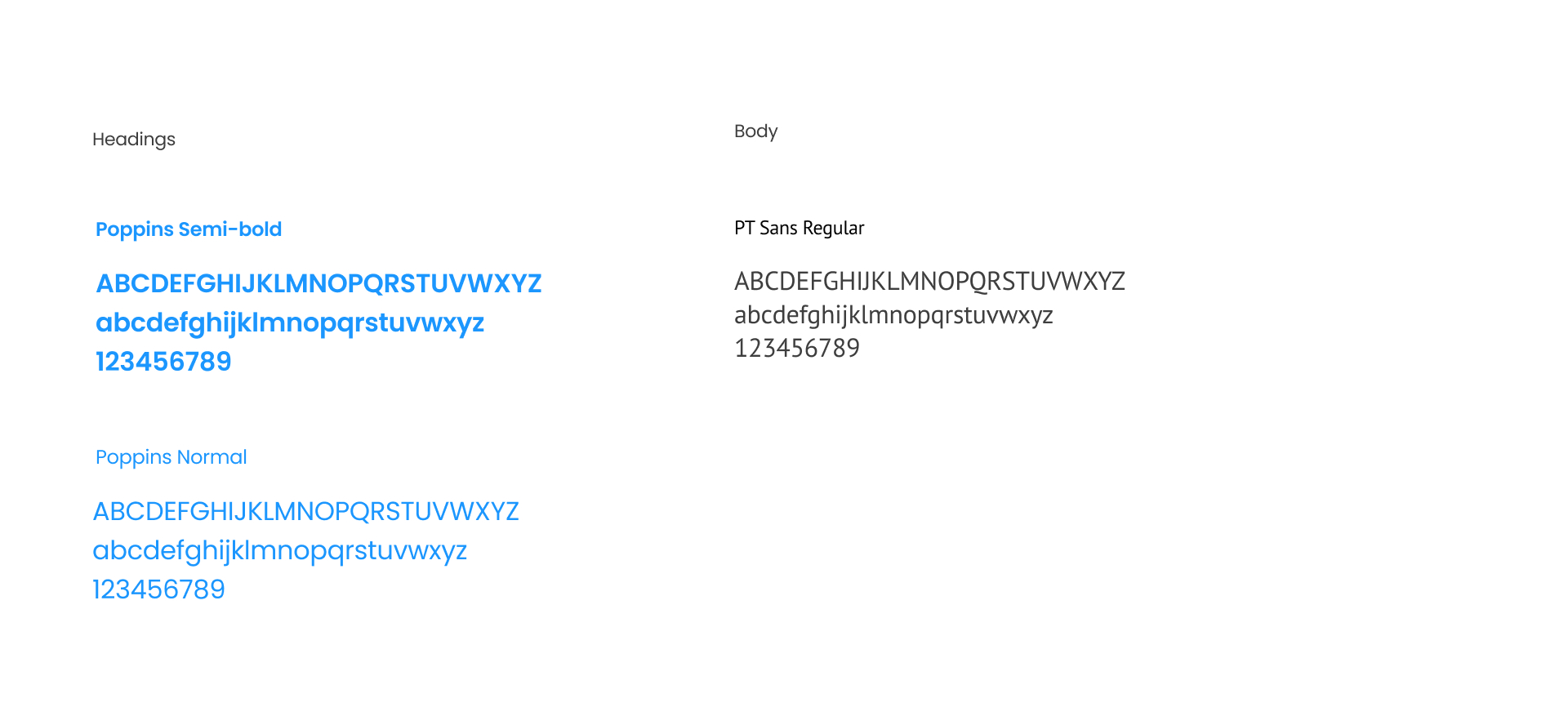
Being a young initiative, the FSNE didn’t have a brand identity when the project started, only a logo. We started off by building basic branding guidelines, like a color palette and a typography selection, to create a cohesive visual style.
Colors

Typography
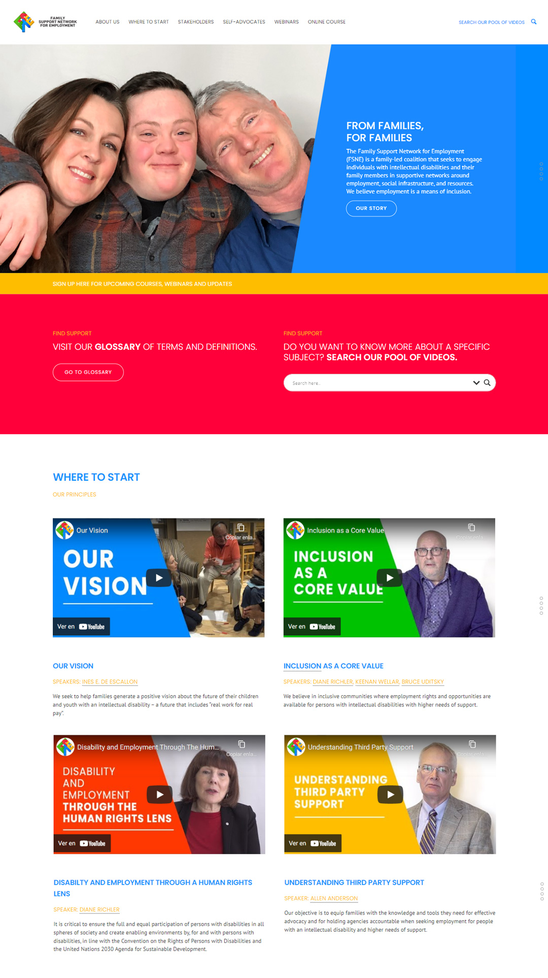
With the information architecture and the visual style ready, we started building wireframes and mockups of the main pages in Adobe XD.
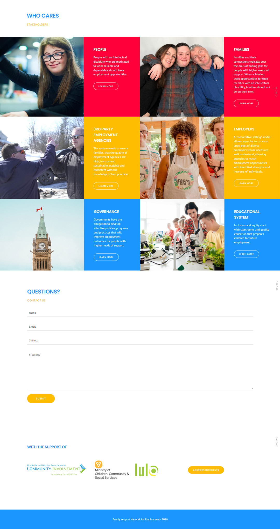
An early design was presented to different members of the initiative who highlighted the importance of having images on the site that showed FSNE as an organization led by the families and the community, not as an employment agency. We shared different iterations of the homepage with the founders who provided feedback on the design and content.
Homepage
Stakeholder page
Each stakeholder page contains a series of videos with key information. The videos feature expert interviews, footage of job-seekers on their day-to-day activities, and key ideas shown as animated titles.
Online Course
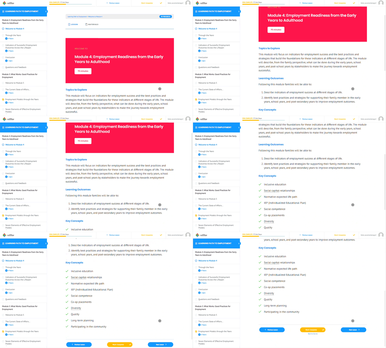
After a few months, the initiative saw the need of adding a solution that allowed users to learn the initiative’s best practices more in-depth and in sequential order. To address this, the leaders wrote an 8-module online course called ‘Learning path to employment’, with step-by-step lessons and quizzes that users can complete in 3 to 6 months.
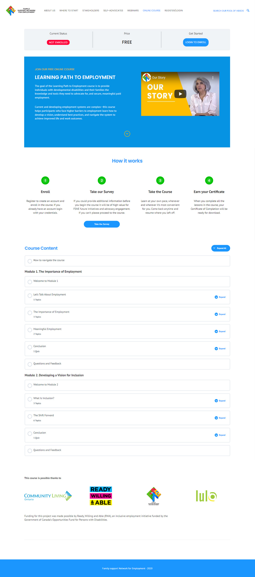
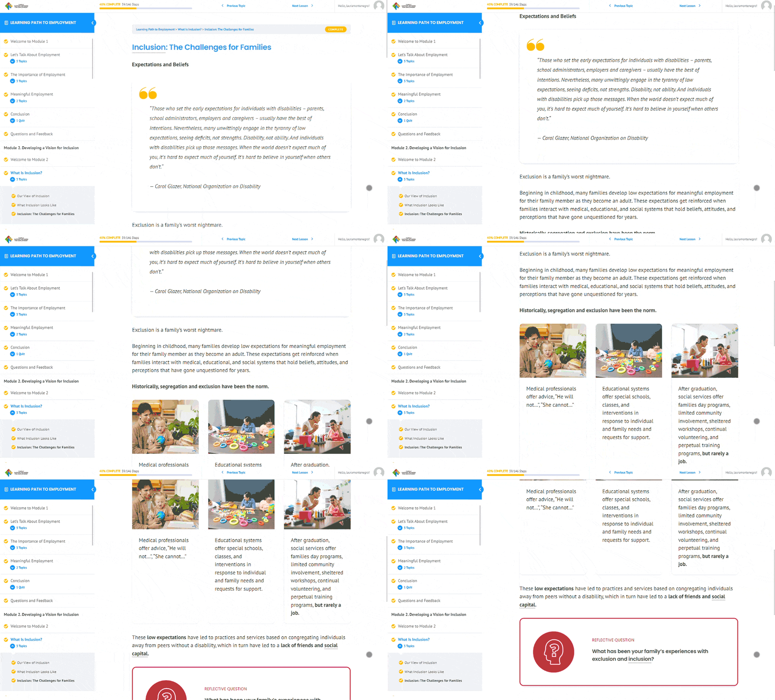
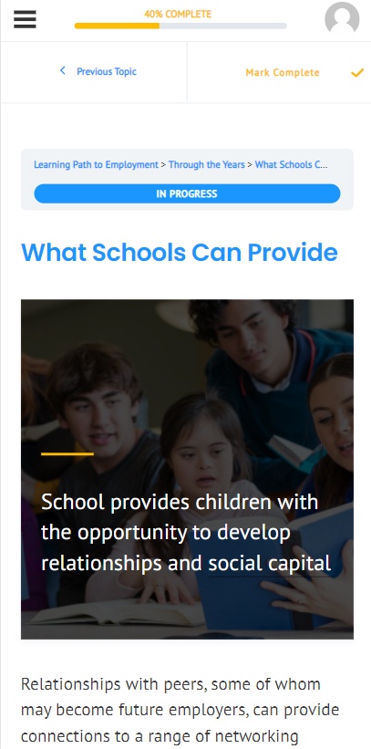
I was in charge of implementing an LMS plugin on the website to build the course. I designed and built the landing page, the login and registration modules, the course dashboard, and the layout of all the lessons in the course. I decided how the content would be displayed, using photos, videos, motion graphics and infographics to illustrate it.
Design System
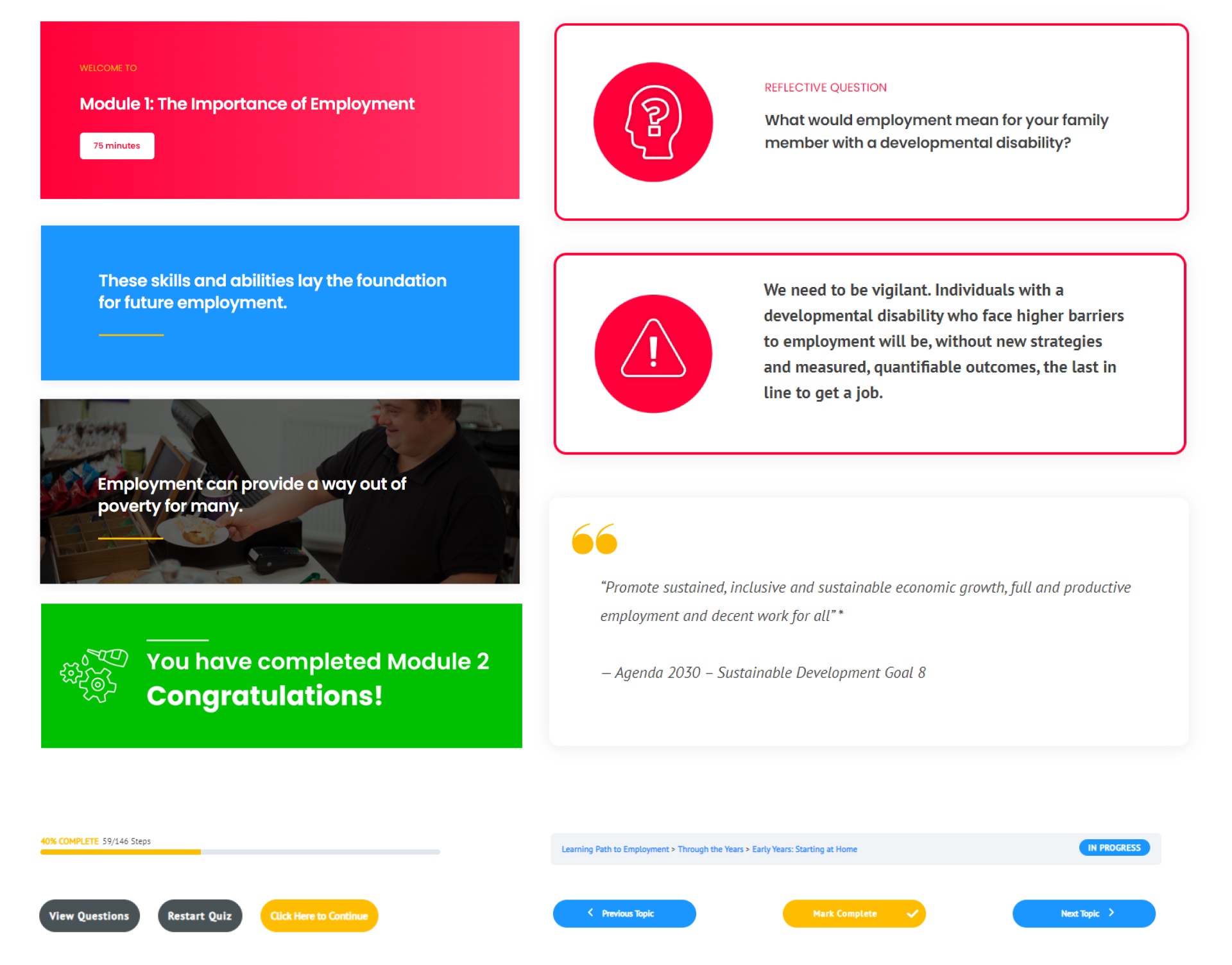
To maintain consistency throughout the course, I developed a design system of reusable elements, such as headers, key phrases, quotes, questions, and more. While building each topic and lesson, I combined these elements creating recognizable UI patterns for the user.
Furthermore, I designed all extra graphic assets needed to illustrate the content, such as icons and infographics, and selected supporting photos. I also managed a team of two video editors who provided a set of videos and animations used in the lessons.
Landing page
Lessons
Accessibility
We implemented different elements in order to make the course more accessible to our audience, including:
-
Text-to-Speech plugin.
-
Videos were embedded using the Youtube player to allow automatic closed captions.
-
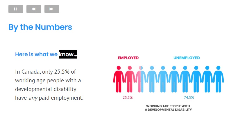
Infographics and supporting diagrams.
-
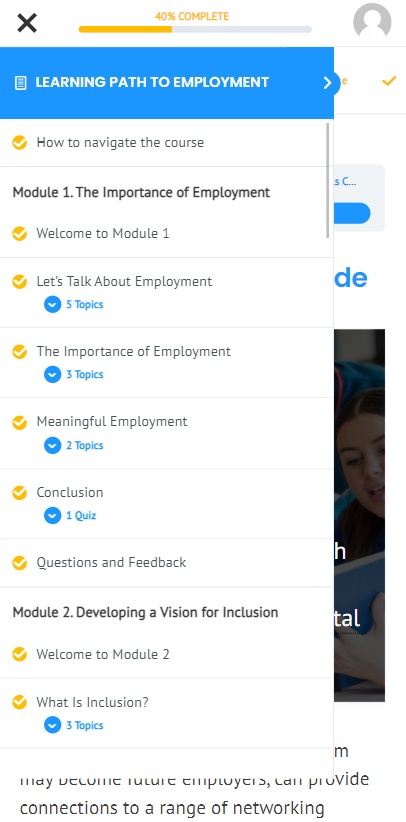
Instructions on how to navigate the course.
Test
After publishing the course in a private URL on the website, ten users were asked to provide feedback on the content and the general experience. We provided them with a document with a matrix where they could add their comments.
Key findings included:
-
Adding instructions on how to use the platform at the beginning of the course
-
Replacing some of the stock images with images provided by the families to make it more approachable
-
Simplifying the user’s input on some of the quizzes.