AGO Audio-tour app redesign
For the Google UX Design Professional Certificate, I reimagined an audio-tour app for the Art Gallery of Ontario (AGO) in Toronto. The design process included user research, defining and ideating solutions, prototyping, and testing.
Academic project completed for the Google UX Design Professional Certificate.
ROLE
UX/UI Designer
TOOLS
Figma, Material Design 3
YEAR
2022
Project Overview
The problem
Old audio tour devices used in museums have limited navigation options for the user and poor accessibility. In-person tours, while entertaining and relevant, are offered at certain times and in a few languages, limiting access to visitors. Current audio-tour apps for smartphones and web apps are great tools for self-guided tours but sometimes lack accessible features for users with hearing disabilities, visual disabilities, or learning disabilities.
The goal
Create an accessible audio-tour mobile app that serves as a digital companion for museum visitors.
This concept app is intended for museum-goers, who would use their smartphones to learn more about the artworks on display, in their preferred language. The app includes audio tours of the museum’s exhibitions and an interactive map that allows users to move between the different artworks.
The app is designed with a clean, modern aesthetic, using the branding from one of Toronto’s biggest art museums, the AGO.
Understanding the user
I conducted research on the tools available in the market, both locally and internationally, to find out more about the solutions used by museums for their tours. I did a competitive audit, analyzing the interaction, visual design, and content of four different competitors.
As an avid museum-goer, I also took on my own experience while visiting museums and talked to fellow peers who also enjoy visiting galleries, museums and art shows to learn more about their experiences.
Pain points
Outdated navigation and wayfinding
Audio tour devices and some modern apps rely on the user to find the stops on a tour themselves, then inputting stop numbers in order for the guides to play. Users must also be able to navigate through venues using either paper or digital maps from other sources.
Poor accessibility
Audio tours are not fully accessible. They need to be easy to use for people with visual, hearing and learning disabilities—as well as those who speak different languages.
Connectivity issues
Data-heavy applications can take a while to load, specially in devices connected through data or in venues where wifi is not available.
Lack of flexibility
Some apps have only one audio guide per tour and not per artwork, which means that users cannot browse the content of a tour or select specific pieces to listen to.
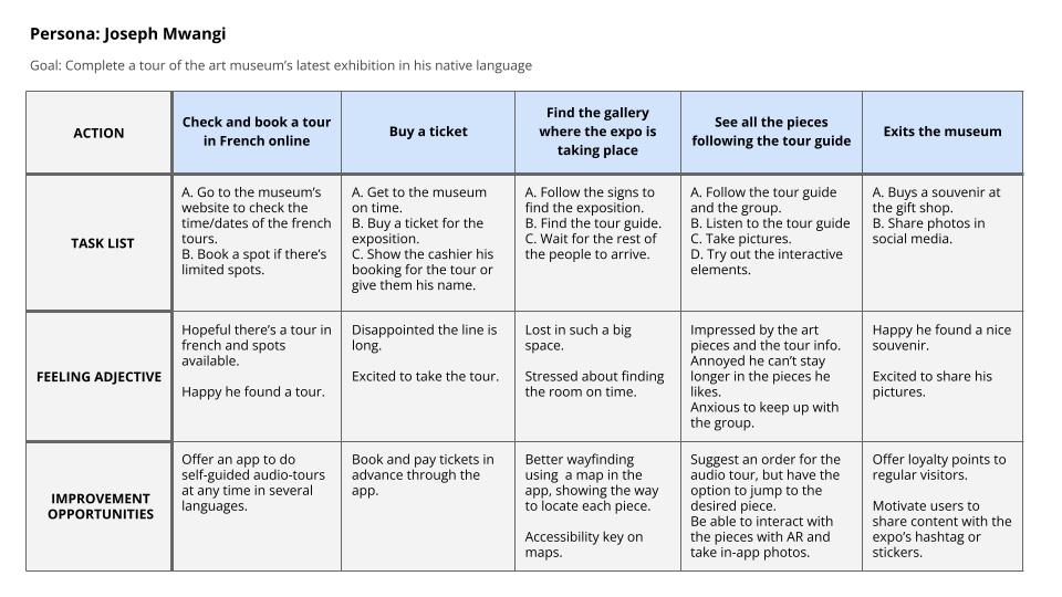
User research led to the creation of personas and a user journey.
Personas
User Journey
Ideation and Prototyping
Goal statement
Our audio-tour app for the museum will let users tour the collections at their own pace and in their preferred language, while showing them the way to each work of art on a map of the venue and directions in augmented reality. This will benefit visitors who can’t attend the in-person tours, speak a different language or want navigate the museum easily.
User flow
![Google UX Design Certificate - User flow [template] (1)](https://lauramontenegroj.com/wp-content/uploads/2022/08/Google-UX-Design-Certificate-User-flow-template-1.jpg)
Paper wireframes
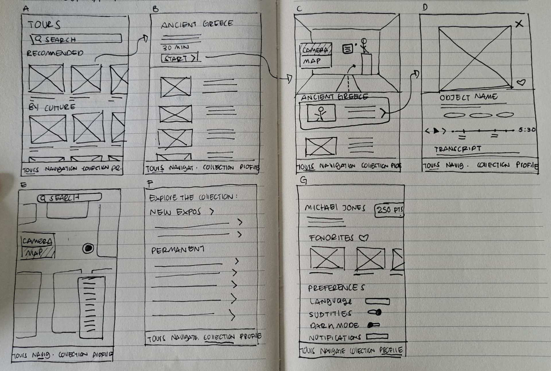
Digital Wireframes
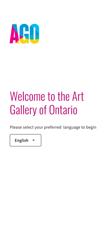
01 Welcome Screen
I designed wireframes of the main user flow, displaying the steps a visitor would take to browse, select and complete an audio tour.
The app lets the user select the language on the start screen to avoid having to change it manually afterward.
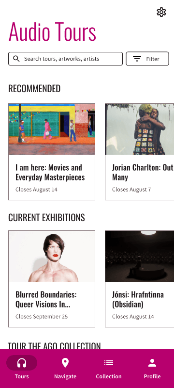
02 Home Screen
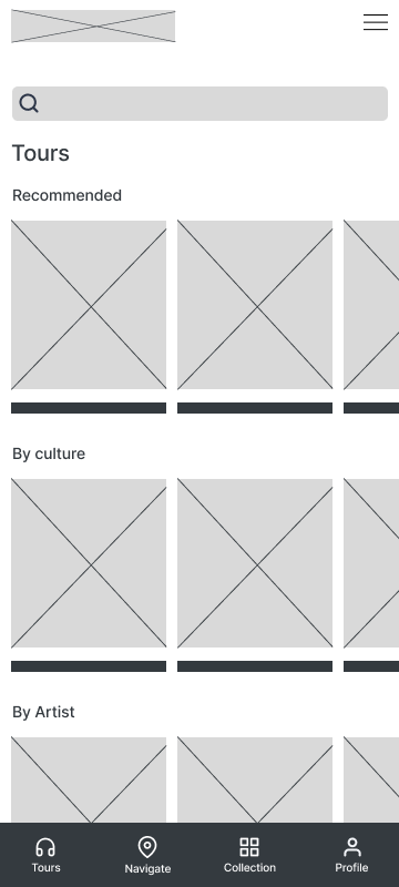
The Tours page lists the exhibitions and collections available using categories, making it easy for readers to find what interests them.
To navigate to a specific artwork, the user can tap on “Navigate,” or explore the whole catalog by tapping on “Collection.” These two screens are available as options in the bottom menu.
03 Tour Screen
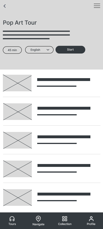
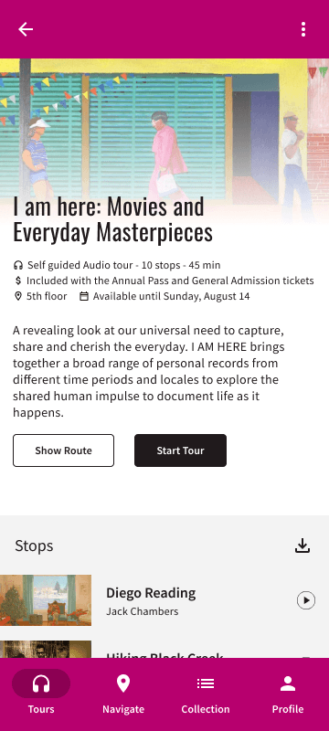
Once the user taps on a tour, a details page displays general information about it and lists the artworks included in the tour. This screen helps users decide whether or not to take that particular tour.
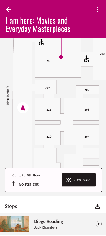
03 Map Screen
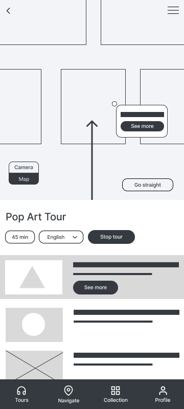
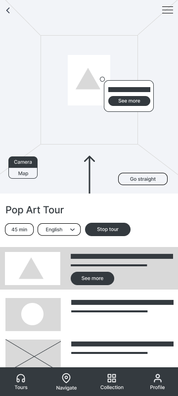
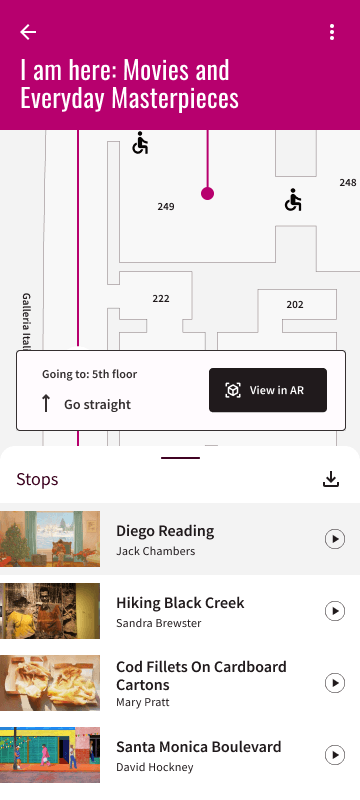
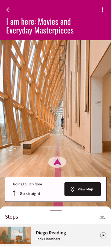
A map of the venue helps users find their way to each stop in the tour, where they can play the respective audio guide. They can also opt to switch to the camera option that displays the route in augmented reality. Just like in a music playlist, users can play the guides in the suggested order or select one from the list.
04 AR Camera Screen
05 Audio Guide Screen
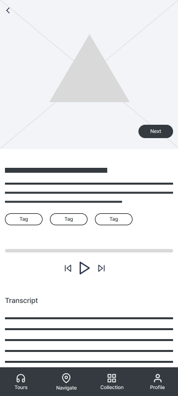
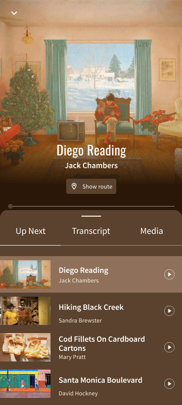
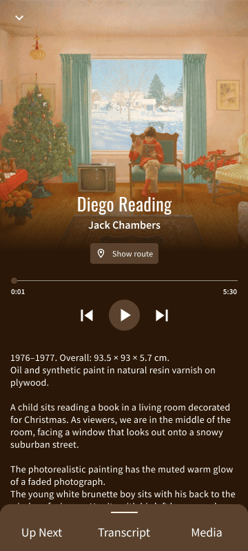
When tapping on a stop, the user is directed to a screen with an image of the piece and an audio player. A transcript of the guide is available for accessibility.
Users can move to the next audio guide by tapping next or go back to the map//camera to find the way to the next stop.
Low-fidelity Prototype
Usability study
With this prototype, I held a remote usability study to find out if users could complete a tour easily and if they faced any challenges while using the app. Six users were asked to complete prompts using the prototype and give their feedback.
Insights
Some users were confused about how the visitor would find their way to the right area before starting the tour.
“It might be helpful to have the map feature introduced earlier when choosing the tours to make sure a user is in the right area.”
“I imagine (the camera) would be very useful – it was difficult to know which tour to choose, what if a user was in the wrong room to do the tour”
The option to show the route to the first stop before starting the tour needs to be more clear.
I added a “Show route” button on the tour details page that leads to the map and kept the “Navigate” page on the bottom menu so the map can be accessed before selecting a tour.
Before
After
For most users, the toggle button is useful, but some found it hard to locate.
“The workflow is good, but the map/camera button is hard to find.”
Some users need better cues on how to change between camera and map.
I switched the toggle button to a larger button that says “View in AR” to increase readability, and increased the size of the directions.
Before
After
The user flow worked for most users, but some had difficulties moving from one stop to the next.
“Thought that the next button on the picture will lead me to more photos of the first painting. This design is a little bit confusing.”
They need a more intuitive way to play the next guide.
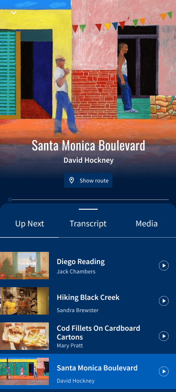
I removed the “Next” button and instead added a bottom sheet with a list of the artworks in the tour, giving the user an overview of all the stops in it, like a music playlist. This way the visitor can simply move to the next stop suggested, or tap on the stop they would like to go next.
Before
After
Refining the Design
I built the mockups using Material Design 3 components and the branding guidelines of the AGO. Using their color palette and typography, I created a theme in Figma. I generated a tonal palette using their primary color, magenta, as the source color and applied the lighter and darker tones to the different components in the app.
For the artwork screens in the tour, I suggested the use of dynamic color, applying a color palette derived from the artwork itself to the UI.
Mockups
01 Welcome Screen
02 Home Screen
03 Tour Screen
04 Map Screen
05 AR Camera Screen
06 Stop Screen
07 Stop Screen
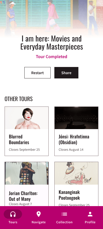
07 End Screen
